A good accent wall does more than add color. It calibrates the room. It can shorten an overly long space, stretch a cramped one, pull focus to a fireplace or bed, or knit together a jumble of finishes. In the homes I have worked in, a single well judged wall changed how people used the room, not just how it photographed. The key is intention, followed by solid prep and durable materials.
Where an accent wall makes the most difference
Start with the purpose. If a room lacks a focal point, create one. If it has too many, choose the primary and amplify it. Bedrooms almost always benefit from anchoring the bed wall, dining rooms from the wall opposite the entry, and living rooms from the fireplace wall or the wall perpendicular to large windows to prevent glare from flattening the color. In narrow rooms, painting the short end wall a darker tone visually brings it forward, easing the bowling alley effect. In low rooms, a vertical treatment like board and batten or full height drapery behind a painted wall draws the eye up and makes the ceiling feel higher.
In open plan spaces, a restrained, textural accent can define the sitting area without building a partition. In small homes, especially the classic Chicago two flat or a prewar condo, accent walls help zone living, dining, and kitchen while keeping the plan airy. Done right, this also dovetails with broader renovation decisions, from kitchen cabinet colors to flooring transitions.
Paint, wallpaper, or architectural texture: the trade offs
Paint offers speed, low cost, and easy reversibility. A deep green or saturated clay on one wall can ground a room without overcommitting. Matte finishes flatter older plaster and hide minor imperfections, eggshell gives you washability in bedrooms and living spaces, and satin is the workhorse in hallways and kids’ rooms. In kitchens and baths, where moisture and cleaning are frequent, step up to satin or semi gloss, and be mindful of sheen contrast with adjacent walls.
Wallpaper brings pattern, scale, and character that paint cannot. A grasscloth gives depth and warmth, a small geometrics suits a powder room, and a mural can open a windowless wall. Think through seams, repeat, and natural light. Grasscloth fades in direct sun and shows every seam. Vinyl coated papers survive steam near a bathroom vanity better than paper backed options. If resale is on your mind, quiet textures tend to age better than loud florals.
Architectural texture, like wood slats, shiplap, beadboard, or even a limewash plaster, turns the wall into a feature. Wood slat walls improve acoustics and look crisp behind a TV. Limewash adds movement without pattern, perfect for a moody bedroom. These treatments need solid layout, good nailing substrates, and clean terminations. They also interact with baseboards, outlets, and window trim, which means the planning step matters more than the install time itself.
How color works on a single wall
Most people pick a favorite color and stop there. In practice, an accent wall should talk to the rest of the finishes. If your kitchen cabinets are a cool gray and your floors are a warm white oak, the accent needs to either bridge those temperatures or commit to one. A blue gray can feel icy next to honeyed floors unless you warm it with saturation or texture. A terra cotta or muted rust can harmonize with oak and give contrast to cool stone or Thinscape countertops, a modern alternative to traditional stone that often leans cool or neutral.
Look at the LRV, or light reflectance value, on the paint chip. Values under 20 read dark. Values in the 30 to 45 range usually deliver enough contrast without shrinking a room. In a north facing space, colors skew colder and grayer. In a south facing room, colors warm up a step. Always test on the actual wall with at least a 2 by 3 foot sample and watch it at morning, afternoon, and evening. I have seen blue grays look green beside a lawn in full sun and go purple next to warm LED lighting. Speaking of lighting, trim your color choice with your bulbs. In kitchen lighting design, a 2700K to 3000K bulb will soften cooler hues and flatter skin tones in dining areas.
Five reliable accent wall strategies that hold up
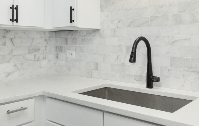
- Deep, matte tone behind the bed: A charcoal, midnight blue, or aubergine in matte hides imperfections and frames art and bedding. Keep the adjacent walls a step lighter in the same family for cohesion. Textured paper in the powder room: Small spaces love big personality, and you only have four corners to manage. A wipeable vinyl texture or a grasscloth look adds luxury without overpowering. Wood slats behind the TV: Vertical slats in stained oak or walnut look tailored and double as a cord management opportunity. Use a 3/4 inch spacer for shadow lines and a finished edge at returns. Limewash in the dining room: The movement in limewash reads like soft clouds. It gives depth during the day and glows under warm pendants at night. Seal if it is a high traffic wall. Tile as a kitchen accent: If open shelving is part of your plan, continuing tile to the ceiling on one wall can act as both backsplash and feature. This aligns with the complete kitchen backsplash installation approach and protects the wall behind coffee stations and ranges.
Revive 360 Renovations on what makes an accent wall succeed
When we install a feature wall at Revive 360 Renovations, the conversation starts with the room’s function, then lighting, then sightlines from adjacent spaces. In a recent bungalow update, the clients wanted a visual divider between living and dining without walls. We used a soft olive on the dining wall, a shade connected to the kitchen’s cabinet color, and wrapped that hue onto the archway’s inside return. The color linked three spaces and made the original plaster details sing. Prep took longer than paint. We repaired hairline cracks, skim coated a picture rail patch, and sanded back to a smooth base. The final result looked simple, which is always the goal.
Another project involved a condo living room where the TV and a fireplace competed. The mantle had no presence. Revive 360 Renovations redesigned the wall with painted shiplap to the ceiling, built a low profile surround, and ran a deeper blue across the wall to push the TV visually into the background. A narrow painted return at the side walls kept the feature from feeling like a sticker. The acoustics improved, the mantle gained proportion, and the https://brooksqhzy545.iamarrows.com/signs-of-water-damage-you-shouldn-t-ignore owners reported they finally used the room after dinner instead of retreating to the bedroom.
Material choices that solve real problems
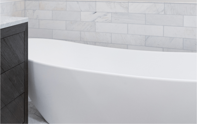
If a wall takes abuse, choose finishes accordingly. Behind a dining banquette, consider a washable velvet panel above a chair rail with a semi gloss painted field above, or use a performance vinyl wallcovering that can pass a sponge test. In kids’ rooms, magnetic paint under a topcoat creates a display wall without pinholes. In a mudroom, vertical beadboard to 54 inches, capped with a robust top rail, lets you wipe off road salt and backpack scuffs. In bathrooms, a tiled wainscot behind a freestanding tub protects from splash. For moisture rich environments, avoid natural grasscloth unless you like patina and seams.
In kitchens, an accent wall that coordinates with cabinets and counters can make the remodel feel more custom without touching the layout. If you are weighing kitchen cabinet painting vs. replacement, an accent wall gives color impact while you decide on doors and drawer fronts. For clients who opt for cabinet refacing to save money without sacrificing style, we often specify a complementary accent on a breakfast nook wall. It visually ties the new door color to the rest of the space and can boost perceived value, something that matters for resale in Chicago where buyers respond to cohesive palettes.
The accent wall as a layout tool in small spaces
Small homes demand smart visual cues. In a small bathroom remodel, a tiled feature wall behind the vanity or in the shower draws the eye and makes the room feel deeper. Lay tile in a vertical stack to raise the ceiling visually, or pick a bold mosaic for the back wall of a walk in shower. In compact kitchens, painting the wall opposite the main prep zone in a deeper tone makes the workspace read cleaner and gives depth for modern kitchen design ideas for small spaces. If you have a galley kitchen, continue the accent color on the open shelving brackets and a narrow strip of ceiling to create a canopy effect without lowering it.
In bedrooms with limited square footage, paint the headboard wall and bring the color onto the ceiling six to twelve inches in. That border frames the bed and softens the room’s edges, a trick that works in vintage units with angled ceilings. For living rooms with one large window, use the wall perpendicular to the glass for your accent. It avoids the washout that sun brings and gives more consistent color throughout the day.
Prep, sequencing, and finish, the unglamorous work that pays off
Most disappointments come from poor prep or rushed sequencing. Even a dark accent can look amateurish if the edges bleed or the base is uneven. Patch holes, skim coat where needed, sand, vacuum dust, and prime patches with the same primer used on the full wall for uniformity. If you have heavily textured walls, a Level 5 skim or at least a thorough fill and sand will allow matte finishes to glow rather than spotlight every bump.
When the accent wall meets ceilings and adjacent walls, decide on your edge detail. A micro bevel from a laser straight line makes a crisp transition, but it requires a steady hand and sharp tape. Alternate approach, paint the adjacent wall first, bring its color around the corner by 1/8 inch, then cut the accent color into that knife edge. For wainscoting or wood details, pre paint boards, install, fill nail holes, then touch up. On wallpapered accent walls, plumb your first drop even if the corner is out, and accept that the final sliver at the far corner may vary to keep the pattern square to the room.
If other projects are underway, sequence logically. Drywall repair comes before paint. If you are refinishing floors, always finish floors first, then paint the accent wall last to avoid dust spoiling the finish. During a complete bathroom remodel, we tile and grout the feature wall, then paint adjacent areas. Wet tile setting and paint do not mix. The smell and moisture can affect cure times.
Revive 360 Renovations: lessons learned from mixed material feature walls
Combining materials takes restraint. A walnut slat wall plus a high contrast paint plus a patterned rug can fight for attention. At Revive 360 Renovations we often choose one star and one supporting player. In a recent primary suite, the clients wanted both limewash and slats. We ran slats behind the bed up to two thirds of the wall height, capped them with a clean rail, then limewashed the upper third and ceiling in a paler tint of the same color family. The slats provided rhythm at human scale, and the limewash handled the light. That blend felt layered, not busy.
A different home had a hallway that felt like a tunnel. Rather than paint the long wall dark and risk making it feel narrower, we installed a mid height beadboard in a durable enamel and painted the upper wall and ceiling in a soft off white. At the far end, we created an accent wall with a warm clay tone. The eye traveled to the colored plane, shortening the hall visually. The enamel on the beadboard took daily wear from bags and jackets. The client later told us the hall was the most photographed spot during gatherings, proof that practical choices can still delight.
Choosing a color with resale in mind
If you are planning to sell within a year or two, accent walls can still be bold, but aim for colors that photograph well and appeal to a wide audience. The best neutral paint colors for home resale tend to live in the soft greige, muted taupe, warm white, or subdued blue green range. A charcoal accent behind a fireplace or a soft navy in a study read upscale in listing photos. If your Chicago buyer pool leans toward clean modern, avoid red or bright yellow accents, which are the first to trigger repaint requests. Pair accents with simple hardware and lighting, a tip that aligns with how to choose hardware that complements your kitchen cabinets and keeps updates cohesive.
A quick decision filter when you feel stuck
- What is the focal point today, and do you want to reinforce it or move it? How does light hit the wall in morning and evening? Is the wall prone to fingerprints, bumps, or splashes, and do you need a wipeable finish? What is the nearest large surface color, like flooring, cabinets, or a sofa, and will the accent harmonize or contrast it? Will the accent create a logical path of color through adjacent rooms?
That short checklist has saved more than one project from second guessing on paint day.
Kitchen and bath accents that pull their weight
In a kitchen, the accent wall can serve as a visual backdrop for a freestanding island. If you are exploring kitchen island design for size, style, and functionality, remember that a darker wall behind a light island boosts contrast and helps the island feel intentional. Conversely, if you have rich dark cabinets, a light and textural accent wall can keep the space from collapsing into a cave. Some homeowners choose open shelving. The pros and cons of open shelving are well documented, but one advantage is the chance to display against a colored or tiled accent. If you do it, run power to the wall for a clean look and position shelves to avoid cutting through tile murals or large patterns.
Bathrooms offer even richer options. A panel of vertically laid tile behind a freestanding vanity adds height. In a walk in shower vs. bathtub debate, showers win for daily use, and a feature wall in the shower becomes the new star. Pick a tile that will stand up to scrubbing and choose a grout that resists staining. Epoxy grout in a medium gray is often a happy middle ground. Bathroom lighting matters here. Wash the accent wall with sconces or a modest uplight, and you will get texture at night without hotspots.
Accent walls and floors, the often ignored relationship
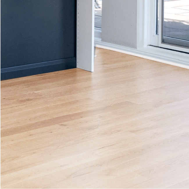
Flooring sets the stage. If you have warm, knotty white oak, lean into earth tones or warm grays on the accent wall. With walnut or dark engineered wood, a cool blue or green can keep the room from feeling too heavy. Tile floors in entries and baths invite bolder walls since they already introduce pattern. In high traffic Chicago homes, the best tile options for high traffic areas pair well with textured walls. Just watch the grout lines and wall patterns so they do not clash. If you plan to refinish hardwood, sample stain colors alongside your wall color choices. The complete guide to hardwood floor refinishing is a project in itself, but the key takeaway is that stain undertone and wall color undertone must be friends, not uneasy neighbors.
When to skip the accent wall
Sometimes the room asks for quiet. If the room already has a stone fireplace with assertive veining, coffered ceilings, or a dramatic view, adding a bold wall can distract. In very small rooms with low ceilings, a fully saturated accent may crowd the space. In those cases, use tone on tone instead. Paint the trim and wall in the same color, different sheens, and let the architecture speak. Or place the accent on the ceiling. A pale sky blue or soft blush overhead can be magical in bedrooms and nurseries, and it will not compete with art or shelving.
Another reason to skip an accent wall is when your furniture is a moving target. If you change pillows and rugs seasonally and enjoy variety, commit the permanent surfaces to neutrals and bring color through textiles and art. The accent wall can wait until the rest of the room settles.
Practical timeline and budget thinking
Most paint based accent walls fit into a day’s work, not counting drying time and priming raw patches. Wallpaper takes longer due to layout and seams, usually a half day to a full day for a single wall, depending on obstacles. Wood treatments vary more. Slats or shiplap can be a day or two with finish work, especially if outlets and sconce boxes need adjustment. Limewash is fast to apply but benefits from multiple thin coats and a cure period before sealing. If you are renovating elsewhere at the same time, build the accent wall into your whole house painting plan so that masking and prep are efficient, and cross trades are not tripping over each other.
As for cost, materials vary widely. Paint is modest. Quality wallpaper and professional installation add up, but often make the highest impact in small spaces like a powder room, which aligns with powder room design ideas that aim for a statement at manageable scale. Wood treatments sit in the middle to high range depending on species and finish. If sustainability matters, look for eco friendly remodeling options like low VOC paints and FSC certified wood. The scent and off gassing profile of your finish will change how the room feels for weeks, something families with kids or sensitivities notice.
Revive 360 Renovations: a measured approach to bold choices
Clients sometimes ask whether an accent wall will date the home. Trends cycle, but considered choices do not. Revive 360 Renovations encourages clients to treat accent walls as part of an overall palette. In a 1920s brick home, for example, we kept the main walls plaster white and set a single deep oxblood wall in the dining room, balancing it with oil rubbed bronze hardware and warm linen drapes. It felt classic, not trendy. In a loft with concrete ceilings, we used a clay limewash on a long wall to soften the industrial feel, complimenting light oak floors and minimalist cabinets. Both homes felt truer to themselves after the work.
We have also undone accent walls that were fine individually but wrong in context. A client had a teal wall in the living room, a red in the dining room, and a purple in the hall. Each color was well chosen, but the sequence felt like a patchwork. We edited to a single accent and used textiles to introduce the other hues. The flow calmed, and the home felt larger.
If you want to DIY, avoid these common pitfalls
Painter’s tape is not a cure all. Cheap tape bleeds. Use a quality delicate surface tape on fully cured paint and burnish the edge before painting. Cut in by hand where the wall meets textured ceilings, or you will end up with a wavy line. When rolling a dark color over a light one, add a gray tinted primer first. It reduces coats and improves color depth. For wallpaper, mark stud locations on the ceiling before you start so you know where you can nail a temporary ledger for heavy panels. With wood slats, confirm the wall is plumb and the floor is level. If they are not, decide whether to keep slats true to level or follow the floor. We usually split the difference and hide the adjustment at the baseboard.
Finally, measure twice for electrical interference. Moving a single sconce an inch after tile or slats go up is a pain. Plan the layout with outlet covers and furniture heights in mind.
A note on how accent walls interact with cabinetry
Kitchens and built ins are the permanent players in many rooms. If you are in the middle of deciding between painting cabinets or replacing them, remember that an accent wall can test your color bravery without committing your millwork. Should you replace just your cabinet doors, or change hardware to refresh the look? Those decisions touch how the accent color reads. A brushed brass pull against a deep green wall gives warmth, while matte black against blue reads modern. If you plan to maximize storage in a small Chicago kitchen, keep upper cabinetry light and use the opposite wall for color so storage remains airy.
For bathrooms, the vanity wall is a logical accent zone. How to choose the right bathroom vanity for your space intersects with the wall choice. A natural wood vanity against a dark, velvety wall looks rich. A painted vanity in a color close to the wall, different sheen, creates a monolithic, custom look without the custom price tag. If you are comparing bathroom countertop materials, consider how veining or speckling reads against the wall. Busy top, calmer wall. Simple top, the wall can carry more personality.
Bringing it all together
Think about accent walls as part of the room’s storytelling. They are not just color, they are a way to marshal attention, balance proportion, and tune the mood. Tie them to your flooring, cabinetry, lighting, and daily life. Aim for durability where hands will touch, softness where you want calm, and a bit of surprise where guests will pause. Test before you commit. Respect the light. And when the room already has a strong voice, help it speak more clearly rather than shouting over it.
If you keep those principles in hand, a single wall can carry a lot of design weight, often more than a cart full of accessories. Whether you choose a quiet limewash in the bedroom, a tiled panel in the shower, or a sharply drawn charcoal behind the sofa, the right accent will do the quiet work of making your home feel more intentional, more cohesive, and more yours.